
Fall Admissions Brochure Featured Student Stock Photos
Community Surprised to See Non-Parker Faces
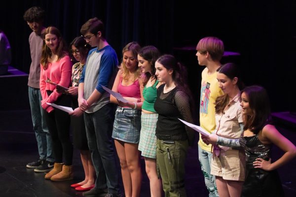
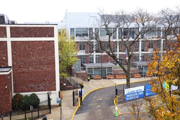
In September the Parker Admissions department released a 13-page brochure targeted towards prospective families, much like those one would find on a college tour. On the cover nine words are stacked vertically, describing Parker students as “achievers,” “believers,” “inventors,” etc. Inside, in a green, pink, and blue color scheme amidst praise for Parker and its mission, one can find, posing, five different “Parker” students–dressed in both Parker gear and ordinary clothes–who are not in fact Parker students. This is the first time that the school has used stock images instead of enrolled students exclusively.
Some students were angered by the brochure, as they felt the school was falsely representing the student body.
“As someone who has gone to Parker for 14 years, I was really disappointed when I saw that brochure,” senior class president Allie Bensinger said. “To look at a brochure representing what is supposed to be the best of our school and see something that didn’t represent Parker was really disappointing. I should have opened that brochure and felt that Parker, which has such a vibrant community, should have exploded off the pages. When I looked at the brochure, I felt angry and confused instead. It felt like it was attempting to create this ideal image of what they think families want to see in a Parker brochure.”
For the past 14 years, the Communications and Admissions departments have worked together to create brochures designed mostly by Communications Director Dominic “Nick” Saracino. During April of last year, the school worked in conjunction with an agency called Synergy, who helped come up with a new approach to the brochure. The decision to work with them came from the school wanting to make the brochure better and wanting outside resources with additional perspectives that could differentiate the Parker experience from those of other schools, according to Saracino and Chief Advancement Officer Gina Rodriguez.
The Admissions department declined to comment on the September brochure.
Around June of last year, Synergy presented the school with different concept presentations for the brochure
“In the end, we loved the compelling approach, but it was late June, we don’t have kids, and we were assessed with a choice,” Saracino said. “We could make phone calls for the type of students we want, hoping they were available, and invite them to the school to pose them up and shoot them. We kind of leaned into the agency and said, ‘What would you do in this scenario?’ and they said flat-out, ‘I don’t think you could even make it by then.’ It was a question where we said we’ve never done it before, but we’re going to do it. And we did.”
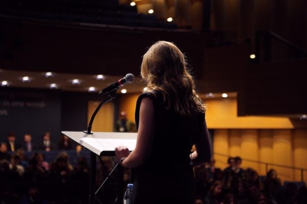
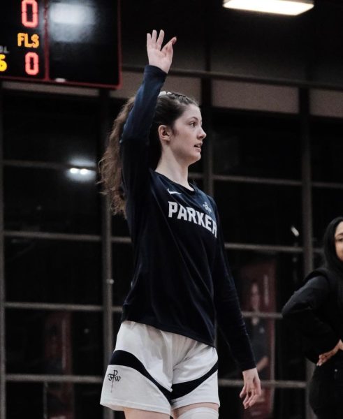
The stock figures, or “hero photographs,” featured in the brochure each fill at least half a page and are seen smiling and looking up or at their computers and papers. There are two female and three male figures, three white students and two black students. A young white woman holding a volleyball wears a photoshopped Parker jersey inside a blurred gym. A young white male sits inside a science lab covered with beakers in front of a window that frames green trees.
Within the brochure, small black and white pictures taken at Parker of enrolled Parker students are also compiled together into collages on three of the inside pages.
“I think it’s really beautiful,” Vice Principal Ruth Jurgensen said of the brochure. “It does capture a lot of what we do offer, particularly in the programming and how we see our students and where we want our students to be when they graduate. I think the material certainly does accomplish setting those expectations up for prospective families.”
The brochure was received extremely well externally, according to Saracino and Rodriguez. It made prospective families a lot more curious about the school. It made Parker “sticky.” But it fell short internally, they said, especially for students. The brochure was designed with a mindset that was more focused on the primary audience than the secondary.
The stock figures were chosen based on the agency’s general feel of the school and its students, as Synergy visited the school around 4 times.
“We had to decide among the five different images, ‘What does the general breakdown look like?’” Saracino said. “We want to keep it within the reality of the school, and so that was essentially looking at our demographic breakup by gender, by ethnicity, and making sure it was a balance. We are only at 30%, so we don’t want to over represent our non-white community. There were a lot of decisions to make.”
According to Rodriguez, it was also hard to figure out how to represent the whole student body by the five pictures. In marketing, Jurgensen said, institutions strive to represent the “ideal” student and the “type” of student the institution desires.
“You often use things that represent the ideal, but sometimes you can’t necessarily capture that image because you’re a dynamic person, and you’re an authentic student here,” Jurgensen said. “How does that translate into using your face as the face of Parker? It’s almost unfair because then at least with someone or something that represents the ideal, you don’t have a personal conflict.”
As of now, the Communications department is working on shooting new photos of enrolled students to be featured in this coming September’s brochure. Saracino will take the model of this past September’s brochure and change up the photos, update the language, and tweak other minor details without the help of Synergy. In a couple of years, there is the possibility of hiring a new agency–but not of once again using stock images.
“Would we do it again?” Rodriguez said. “Never again.”