Cluttered Cafeteria
Why Our Redone Cafeteria Maybe Isn’t So Beneficial
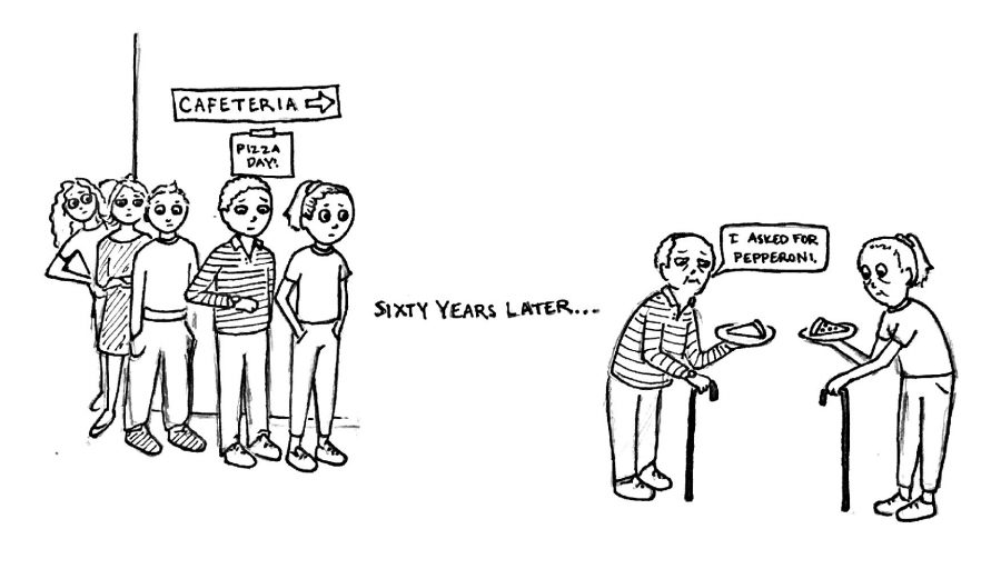
Monday, U-Lunch, 12:35 p.m.: the lunch rush. The line begins in the hallway perpendicular to the science wing, winds its way around the corner, and clogs the hallway as students try to make their way through. Once inside the serving area, students see the bright T.V. screen and neon-green tiled walls competing to project light into the space, which is filled to the brim with students.
At the serving line, two stations serve food, and for those without an appetite for the hot meal of the day, a sandwich bar on the opposite wall provides extra choices. Further in, the students push each other more and more as the space funnels into a three-line register. Desserts, chips, drinks, and fruit are crammed into the walls as students cram to pay for their lunch.
For students who have meetings or other obligations during lunch periods, like me, this process is far too hectic and can be slow, especially during universal lunch periods. What was once a more clutter-free cafeteria room has now shrunk into a mass of hungry people.
The cafeteria was redone over the summer. In addition to a remodeling of the space, renovations included additions of a new dry food storage room, a new sandwich line and hot lunch line, a smoothie bar, an omelet station, TV monitors, and a brand-new kitchen, which was the main purpose of the make-over. This new kitchen is bigger, safer, and up to code.
Yet the serving area itself is smaller. While the new kitchen allows the staff to cook food, the purchasing area makes it harder to buy food. Long lines clutter the interior, and the whole room funnels into a tightly-packed series of registers. Not to mention the huge column (most likely load-bearing) in front of the coolers that restricts space even further.
While obviously safety in the kitchen is the biggest concern when it comes to the layout’s redesign, the general flow of the cafeteria should be thoughtfully considered as well. Student input could have been very helpful, and though the flow was probably considered, the redesign is not completely beneficial. The space is cramped and chaotic.
The new, food-related additions are nice, but are they necessary? While the serving room has expanded slightly, too many of these additions crowd a very small amount of space. We have lost more than we have gained through sacrificing space and time for a smoothie bar and two lines.
With student input–or more student input–this could have been prevented. As one of the main purposes of the renovation was to update the kitchen, a student perspective regarding the flow of the other aspects of cafeteria could have foreseen the current situation.
If students are allowed to participate in the hiring process of teachers (SIRB) and the scheduling of Morning Ex’s for the whole school (MX Committee), why is it that we can’t participate in structural changes to the school?
Also, the updated cafeteria, which arguably serves about the same quality food as it did before, required money, some of which could have been spent more productively on other aspects of school. In the future, though our new cafeteria has its benefits, student involvement in major renovations could result in better changes that would lead to more positive effects on the community.
While I’m sure we’ll all get used to this cafeteria at some point, I’ll still miss the old, clutter-free version and hope that going forward, I can have more of a say in the changes made to our school.


